

In this tutorial, we'll explore how to create a watercolor text effect. This technique makes text appear as if it's been painted onto damp paper, resulting in a distinctive and artistic look. The effect is not only simple to achieve but also produces impressive results that can elevate your designs.
You can enhance the aesthetic by experimenting with various color palettes and backgrounds. This effect is particularly well-suited for scrapbooking projects, adding a creative and personal touch to your pages.
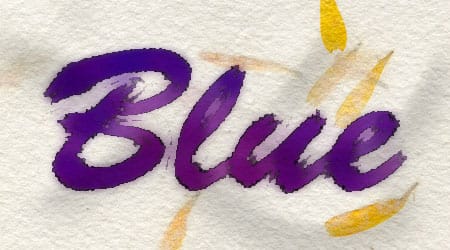
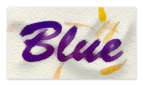
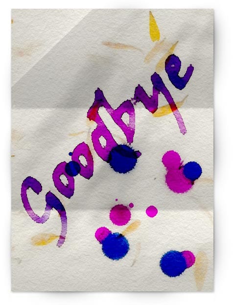
The final result is a strikingly beautiful design that's sure to captivate. The image below offers a preview of what you can accomplish with this effect.
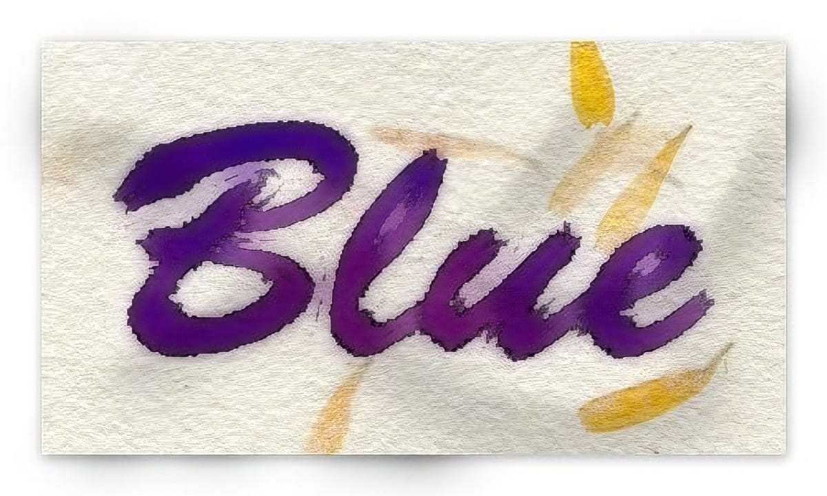
Watercolor Text Effect
Open a new 450px by 250px document with white background. Create a new layer and paint it with white. Choose the Horizontal Type Mask Tool and before starting to type, choose the font you want to use. In this case we will be using Brush Script font with a font size of 200px. Click on the blank document and type the word Blue.
Visit Dafont to find free brush style fonts.
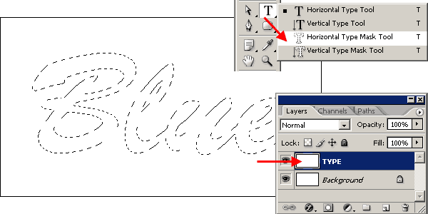
Go to SELECT >> FEATHER and set it to 5px. The feather shouldn’t be too large, the font must remain readable, but don’t set it too small because the effect won’t be noticeable.
Now set Foreground color: #0000CA and Background color: #E300B6. You can use any color you like, but for some reasons, the effect can be quite different according to the colors you choose. When you finish this tutorial, try another colors to see what you get.
Go to FILTER >> RENDER >> CLOUDS. After that, go to SELECT >> DESELECT to remove the selection.

After removing the selection (very important!), go to FILTER >> ARTISTIC >> WATERCOLOR and enter the following values: Brush detail: 1 – Shadow intensity: 0 – Texture: 1. Click OK to apply the filter.

Wet Paper Background
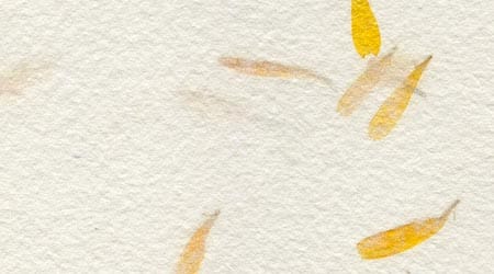
So far the watercolor text effect looks great, but why not make it even better? Copy the paper background image below and paste it into the watercolor text effect document. You can also open a full page, high resolution version of this texture here.
Move the layer below the TYPE layer and name it PAPER. After that, select the TYPE layer and set the Blending mode to Multiply.
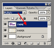
So far the image should look like this:

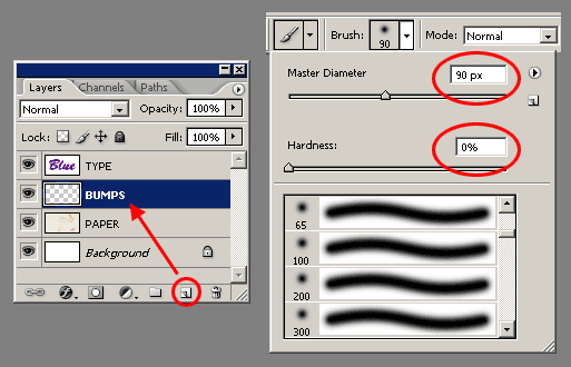
Select the PAPER layer and click on the Add new layer icon on the Layers palette. Name the new layer as BUMP. Select the Paint Brush tool and create a brush tip of Master diameter 90px and Hardness 0.
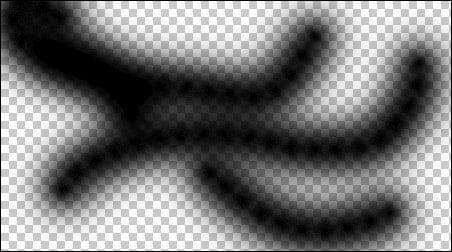
Paint some thick strokes on the BUMPS layer. In the next step, these strokes will become the bumps in the paper. The checker box pattern is just the layer transparency.
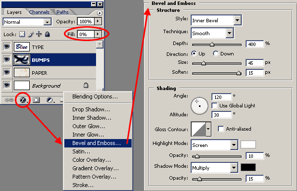
With the BUMPS layer still selected, set the LAYER FILL to 0% and choose Bevel and emboss from the Layer Styles pop up menu. Use the settings shown in the image below.
At this stage, the image should look like the one below:
But the effect is not quite ready. To have a complete illusion of paper relief we will have to add some shadows to “raise” the paper a bit. Set the Background color to white. Go to IMAGE >> CANVAS SIZE and set the width to 500px and the height to 300px. This will add a thick white border all around the image.

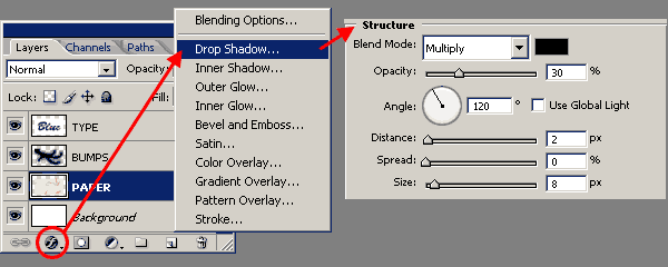
The next step is adding a very subtle drop shadow to the paper. Select the PAPER layer and select Drop shadow from the Layer styles popup menu. Use the settings shown in the following image.
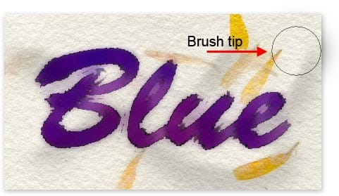
Take a look at the image below and you will see that although the light comes from the top left, the shadow can be seen on all four sides, being the right and bottom sides the most noticeable.This is done by setting a shadow size (8 pixels in this case) larger than the shadow displacement or distance (2 pixels in this case). I often use this technique to make the shading more soft.
Believe it or not, we are not still there! There is a last touch of magic. Select the Paint brush tool and create a 90px brush tip like the one mentioned earlier in this tutorial. Set the Foreground color to black. Select the Background layer and make a single click with the brush near the the edge of the paper. Try different positions of the brush tip to create deeper or lighter shadows. Check the image below to see how it works:
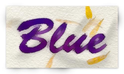
Now make some other clicks in different spots until you believe the paper looks the way you want. The image below shows the final result of this tutorial:
Paper folds and creases
This tutorial you have just finished reading, and hopefully managed to get the same results, can be combined with another tutorial I wrote last year: Creating Paper Folds and Creases. Combining both tutorials you can create something like this image:
In this case, I used Color Burn instead of Multiply as the text and drops layer blending. There are so many settings in these two tutorials that you should play with them. Start with following the instructions as strictly as you can. Once you get the same results, you can start playing with the settings to achieve different results.


