Great design isn’t about adding more.
It’s about knowing what to leave out.
With so much visual noise competing for our attention, simplicity has never been more powerful. Yet most creators, especially early in their journey, assume that more complexity equals more value. More filters. More layers. More effects.
Here’s why that instinct is usually wrong—and why the best designers are the ones who master restraint.
1. The Eye Seeks Clarity
Human perception is wired to prioritize simplicity. Gestalt psychology teaches us that our brains prefer patterns, symmetry, and recognizable shapes.
When your design is too complex, the viewer doesn’t know where to look.
When it’s simple, they know exactly what matters.
2. Simplicity Communicates Faster
You have milliseconds to make an impression. Simple visuals win because they reduce friction—they're intuitive, scannable, and emotionally resonant.
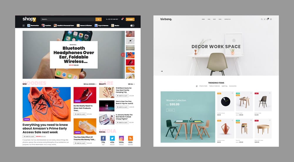
The best designs don’t show everything.
They show the right thing—first.
3. Complexity Is Often Insecurity in Disguise
When designers lack confidence in the core idea, they often try to mask it with visual noise. Effects. Gradients. Shadows. Anything to distract from the fact that the concept doesn’t hold up on its own.
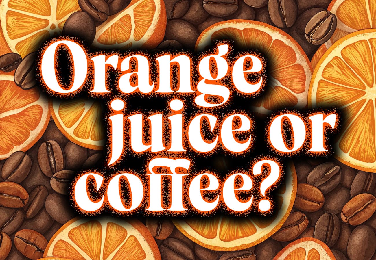
Simplicity requires courage. It means trusting that your idea is strong enough to stand alone.
4. Timeless Design Is Always Simple
Think of the most iconic logos in the world—Apple, Target, Airbnb. None of them are complicated. They’re memorable precisely because they are distilled to their essence.

Complex designs age quickly. Simple ones endure.
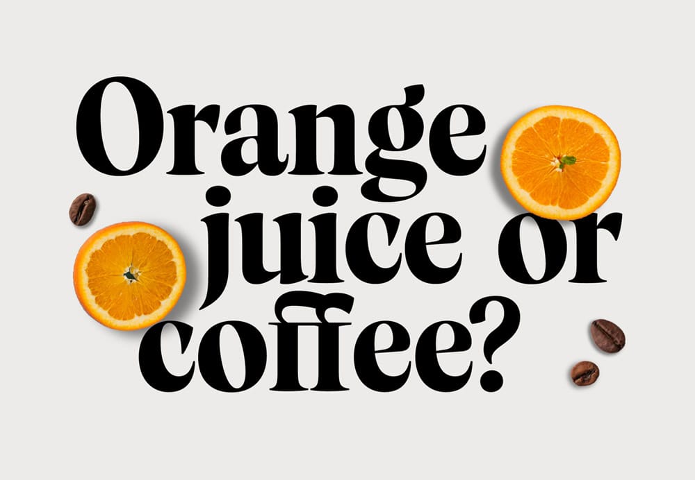
5. Simplicity Creates Breathing Room
In music, silence gives rhythm its power.
In design, negative space gives visuals their voice.

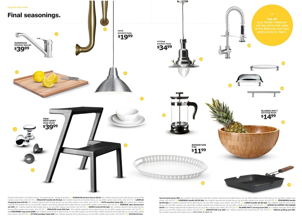
© Food Fair Markets. © IKEA Canada. Design and photography by Leo Burnett Toronto. Copy: Darya Klymenko. Art Direction & Design: Eva Kumpen.
When every inch is filled, nothing feels important.
When there’s space, there’s focus.
6. When Complexity Is the Right Choice
Not all visual complexity is poor design. In fact, sometimes it’s exactly what the moment calls for.
Certain cultural aesthetics—like the information-rich density of Japanese websites—or subcultures like punk, rave, or zine communities, thrive on complexity. Their chaos is the point.
What separates good complexity from bad is intent.
If your design feels loud, layered, or crowded because you want to reflect a messy, electric, emotional experience—then complexity becomes a tool, not a crutch.

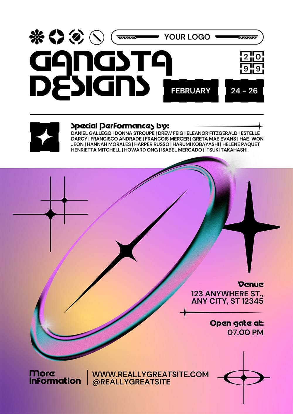
Screenshots © Don Quijote Co., Ltd. (left) | Retro-Futurism Y2K Music Festival Flyer Psd by Gangsta Design (right).
Great design isn’t always quiet.
Sometimes it yells—for a reason.
Conclusion: Know What You’re Saying—Then Say It Clearly
Great design isn’t about proving how much you can do.
It’s about knowing how best to express the idea.
Sometimes, that means stripping everything back to the essentials.
Other times, it means leaning into the noise on purpose.
Unless complexity is the expected visual language of your audience—rooted in culture, subculture, or purpose—simplicity remains the clearest, most effective design choice—because it removes distraction, enhances focus, and allows the core message to speak without interference.
What story is your next design trying to tell?
Make sure the style doesn’t drown out the message.
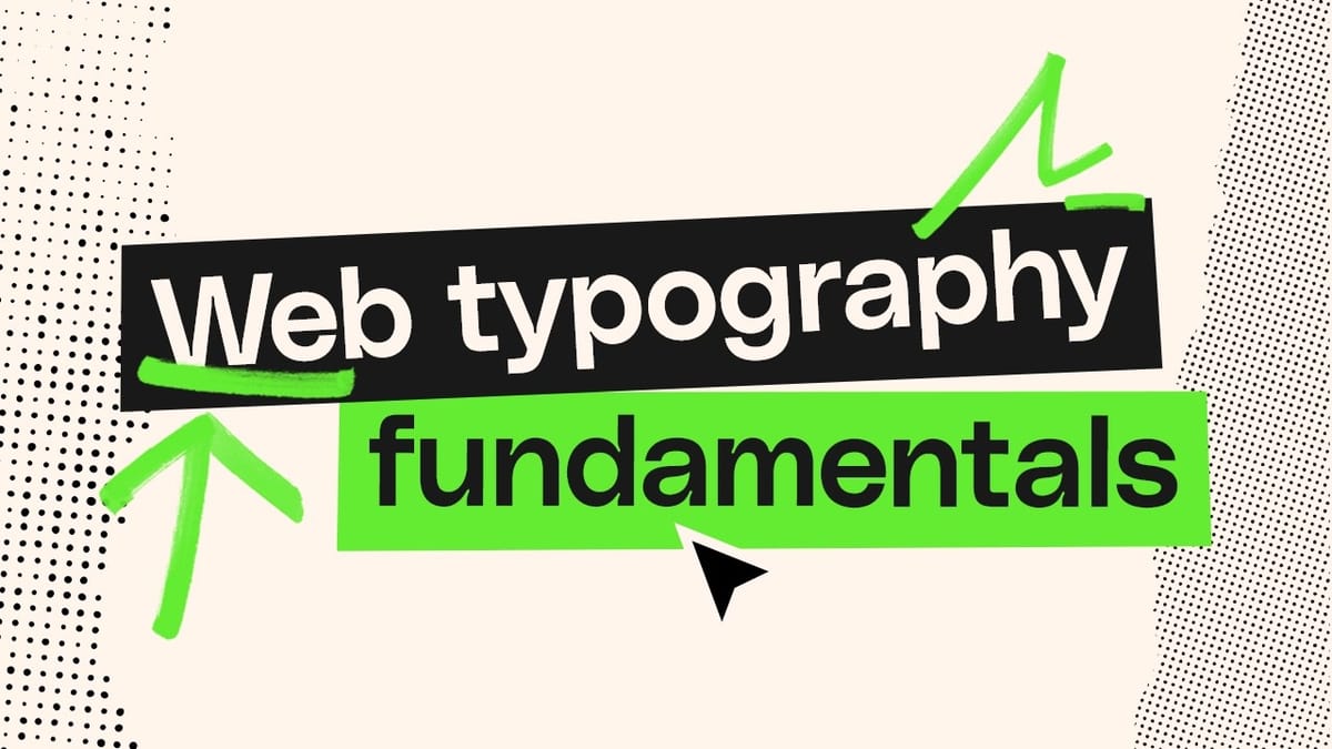
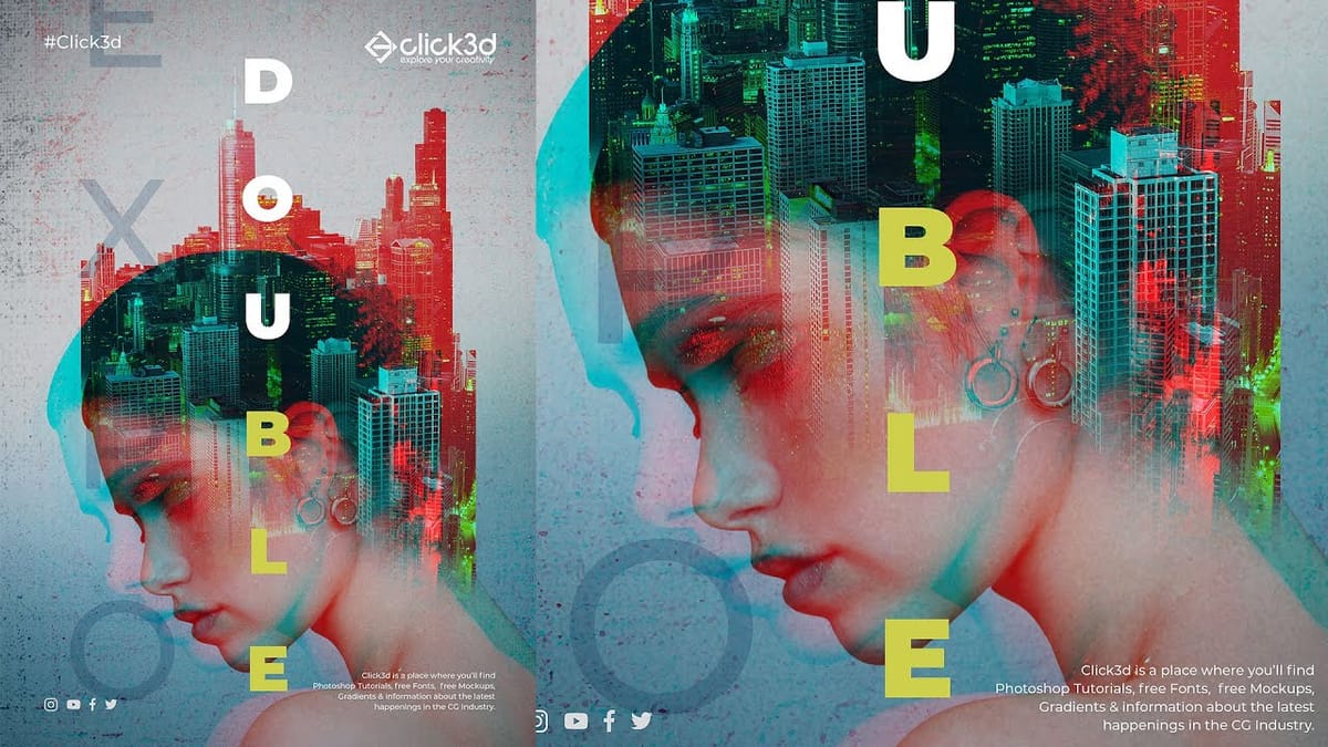
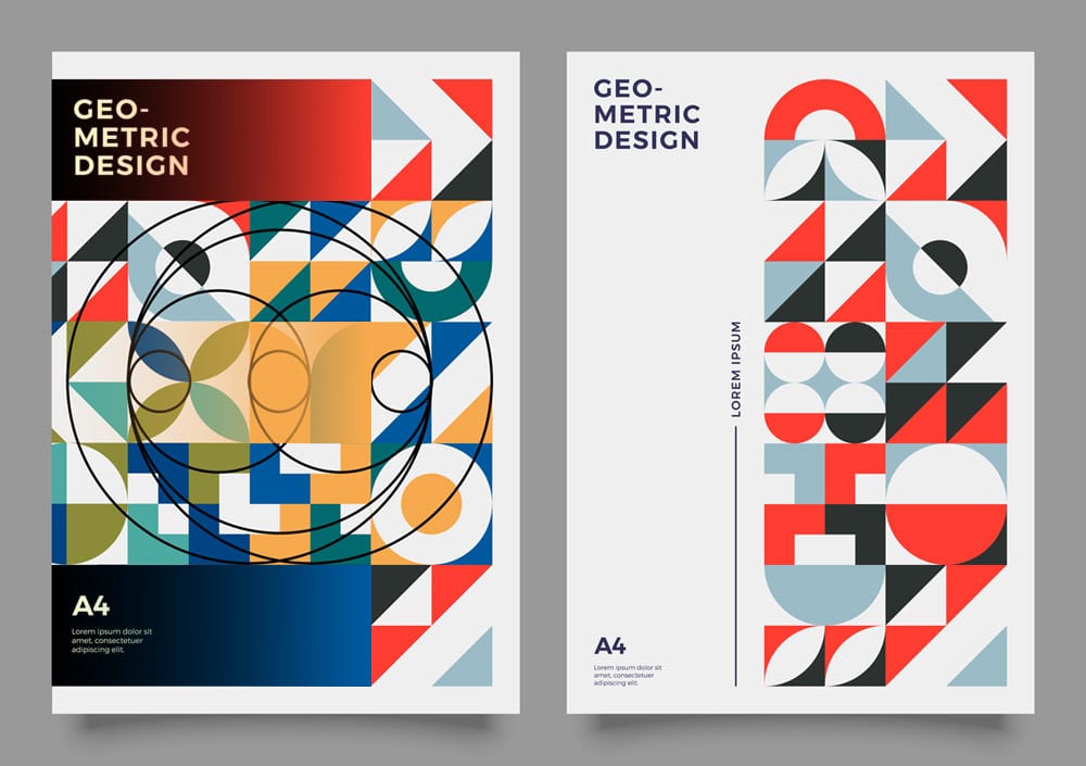
Related Articles and Tutorials about Design and Graphics
Explore more design techniques and creative layout concepts.