Ranking Every Wes Anderson Movie Poster: A Design Analysis

Ranking Every Wes Anderson Movie Poster: A Design Analysis

Wes Anderson's films are renowned for their distinctive visual style, but the evolution of his movie poster design tells a fascinating story of creative growth and collaboration. From the raw indie aesthetic of his 1996 debut to the meticulously crafted artwork of recent releases, Anderson's posters showcase a journey from standard film marketing to integrated artistic expression.

This comprehensive ranking examines all twelve Wes Anderson movie posters, analyzing typography choices, color palettes, collaborative artwork, and how each poster reflects both its era and Anderson's developing cinematic identity. The discussion reveals how poster design evolved from in-house studio work to partnerships with renowned illustrators, typographers, and artists.

Watch the Complete Poster Ranking

Video by Envato Tuts+. Any links or downloads mentioned by the creator are available only on YouTube

The Evolution of Anderson's Visual Identity

Anderson's poster design journey reflects broader changes in film marketing and the director's growing influence over his projects' visual presentation. Early posters like Bottle Rocket and Rushmore were created by studio design teams working independently of the film's production, resulting in marketing materials that felt disconnected from Anderson's emerging aesthetic sensibilities.

The turning point came with The Royal Tenenbaums, which introduced key visual elements that would become Anderson trademarks: symmetrical compositions, ensemble cast presentations, and the first use of Futura typography. This marked the beginning of Anderson's brother Eric Chase Anderson's involvement in both film graphics and poster design, creating consistency between the movie's internal visual world and its marketing materials.

Later films demonstrate increasingly sophisticated collaborations with specialists. Moonrise Kingdom brought in renowned typographer Jessica Hische to create custom lettering, while The Grand Budapest Hotel featured hand-cut typography by Annie Atkins. These partnerships elevated poster design from promotional necessity to integral artistic expression, with each poster serving as both marketing tool and standalone art piece that captures the film's essence.

Key Design Elements in Anderson's Posters

  • Study typography evolution from generic fonts to custom lettering that reflects each film's setting and era
  • Observe color palette consistency, particularly Anderson's signature use of yellow, red, and pastels across different projects
  • Notice the shift from cast-focused layouts to location and object-centered compositions in recent work
  • Examine how cultural and geographical references influence design choices, especially in The Darjeeling Limited and Isle of Dogs
  • Analyze the integration of film production elements like miniatures and illustrations directly into poster artwork

More Tutorials about Poster Design

Explore additional resources for creating compelling poster designs and typography.
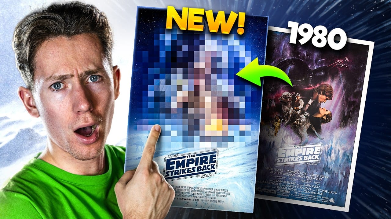
Redesigning a Classic Star Wars Poster in Photoshop
Creating compelling digital art, especially when working with existing iconic material, often presents unique technical and creative challenges. Sourcing high-quality images for older films can be a significant hurdle, leading to compromises in detail and overall visual fidelity. Furthermore, maintaining a consistent design style across a series while allowing for personal skill development over time requires thoughtful execution. This tutorial provides insight into overcoming these common frus
Crafting a Typographic Poster in Adobe Photoshop
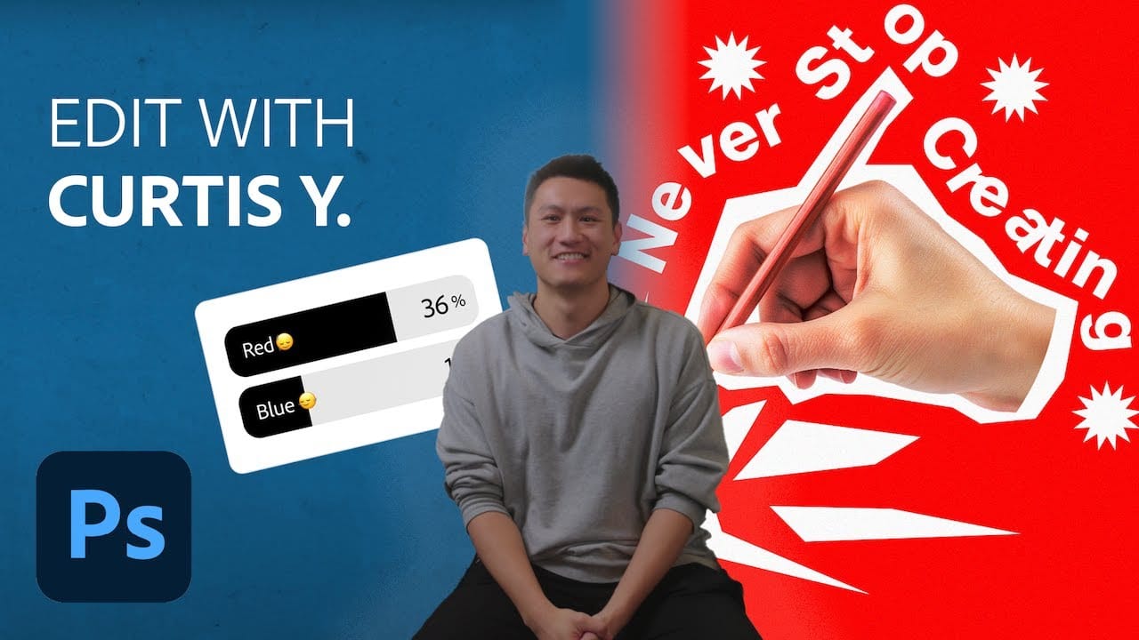
Join Adobe's UX Growth Designer, Curtis Ying, as he transforms a Swiss Typographic poster through an engaging design process. With the input from the Instagram community, this presentation showcases how he carefully selects a bold red background that sets the tone for the entire piece. Throughout the process, Curtis shares his techniques for integrating organic shapes and text that harmoniously flow within the design. Utilizing various Photoshop tools, he guides you step-by-step, making it easy
Create a Vintage, Russian Constructivist Poster in Photoshop
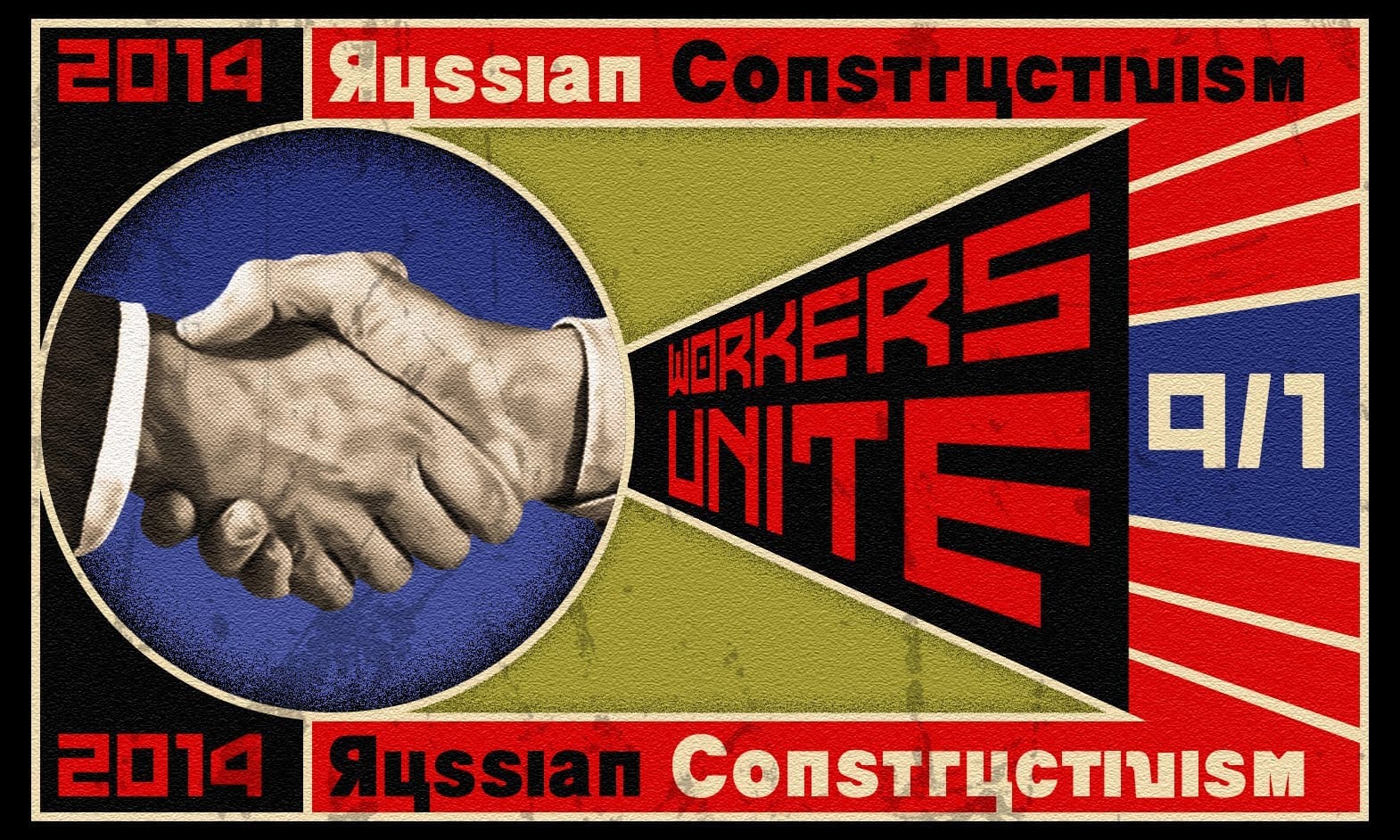
Marty Geller, the creator of Blue Lightning TV, shares a Photoshop tutorial on how to craft a vintage, Russian Constructivist poster. The tutorial draws inspiration from the work of renowned artist Alexander Rodchenko. In this step-by-step guide, Geller walks the reader through the process of creating a striking, retro-inspired poster. The tutorial emphasizes the use of Photoshop's tools and techniques to achieve the distinct aesthetic of the Russian Constructivist movement. Readers can expect
Create a Star Trek Inspired Poster
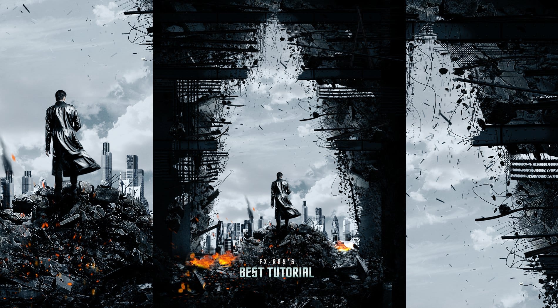
In this tutorial, you will discover how to create a striking poster inspired by the film "Star Trek Into Darkness." This guide focuses on using straightforward techniques, making the process accessible for everyone. You will start by learning how to paint effectively using special brushes that will help you achieve a vivid and dynamic look. The tutorial emphasizes the importance of texturing, which adds depth and interest to your poster. By following the steps outlined, you will learn how to in

Get tutorials & freebies delivered to you.

Subscribe to the Photoshop Roadmap newsletter, a weekly roundup of new tutorials, insights and quality downloads, trusted by 6500+ readers.

You might also like

Understanding AI Image Generation: How It Works and How to Use It

AI image generation has transformed creative workflows across industries. Tools that once required extensive technical knowledge now allow anyone to create stunning visuals using simple text descriptions. The technology has evolved from experimental novelty to practical design solution. This Adobe tutorial breaks down the core concepts behind AI image generation...

How to Design with the Y2K Aesthetic: Typography, Colors, and Effects

The metallic surfaces, bubble typography, and neon gradients of the late 1990s and early 2000s have made a striking comeback. This retro-futuristic aesthetic captures the millennium era's optimistic vision of digital technology through shiny textures, holographic colors, and playful design elements. The Y2K revival offers designers a bold...

Understanding Brutalist Graphic Design: Principles, Techniques, and Applications

Raw concrete meets bold typography in a design movement that deliberately breaks the rules. Brutalism strips away polish and perfection, embracing rough edges, clashing colors, and unapologetically bold statements that demand attention. This rebellious aesthetic resonates with audiences tired of corporate gloss and cookie-cutter designs. Fashion brands, music labels, and...

Understanding Grunge Design: Typography, Textures, and Visual Style

Grunge design refuses to play by conventional rules. Born from underground zines and music culture in the late '80s, this aesthetic embraces chaos, imperfection, and raw authenticity over polished perfection. The style thrives on distressed typography, layered textures, and intentional disorder. As digital design becomes increasingly automated and clean,...

Breaking Web Design Conventions: Learning from Magazine and Editorial Design Masters

Most web designs today feel disappointingly similar — endless variations of the same full-width banners, three-column layouts, and predictable grid systems. While frameworks and templates have made web development more accessible, they've also created a visual monotony that fails to capture the unique personality of brands and businesses. This...

You’ve successfully subscribed to Photoshop Roadmap
Welcome back! You’ve successfully signed in.
Great! You’ve successfully signed up.
Success! Your email is updated.
Your link has expired
Success! Check your email for magic link to sign-in.