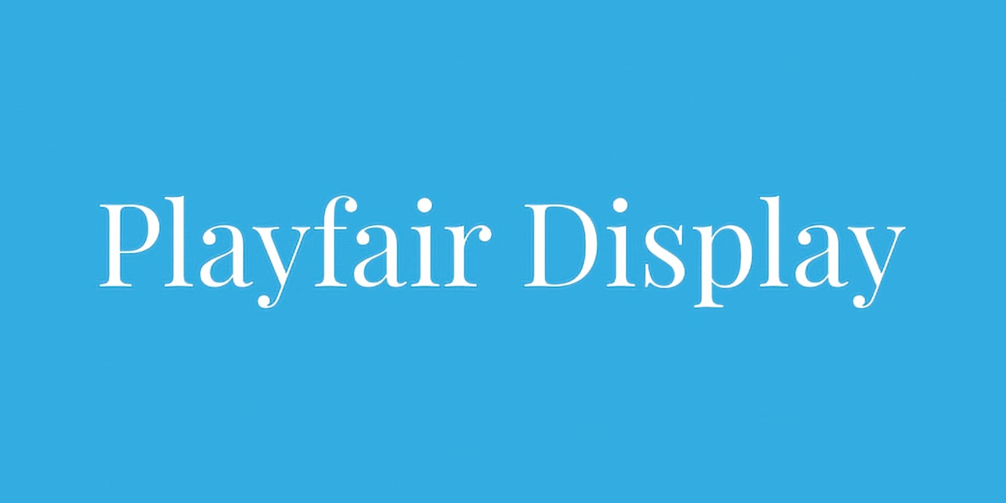
Playfair offers a unique insight into transitional type design, particularly during the European Enlightenment in the late 18th century. At this time, the shift from broad nib quills to pointed steel pens changed the way letters were formed. This transformation, alongside advances in printing technology and paper production, led to the emergence of typefaces characterized by high contrast and delicate hairlines, often moving away from traditional letterforms.
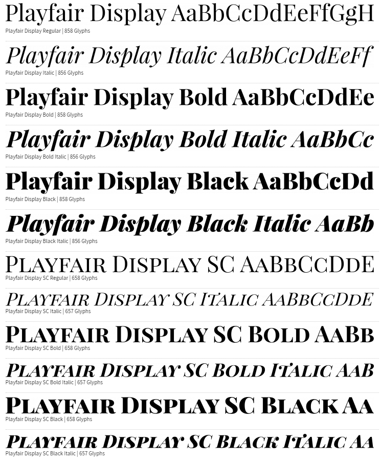
Initially published in 2011, Playfair received a significant update in 2017. This display typeface functions well at larger sizes and pairs nicely with body text options like Georgia or Gelasio. In 2023, the complete Playfair design was introduced, featuring a variable font that adapts to different optical sizes.
The family includes a small caps variant, Playfair Display SC, and offers a comprehensive set of features, such as common ligatures and discretionary ligatures. The project is spearheaded by Claus Eggers Sørensen, a type designer based in Amsterdam. For those interested in contributing to this design, resources are available on GitHub.
Download this font and 99 others for free in the
Bold & Beautiful 100 Fonts Bundle.


