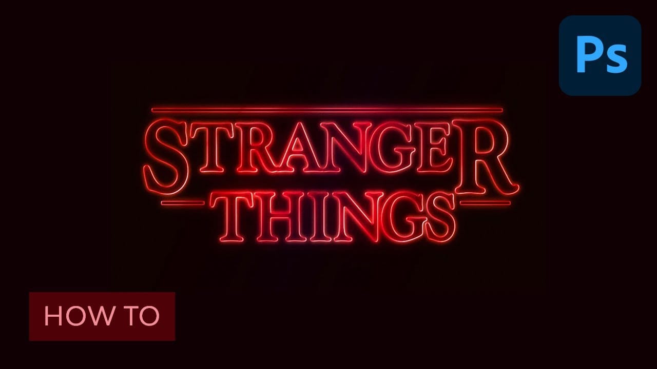
Learn to create the iconic, glowing Stranger Things text style. This tutorial demonstrates how simple Photoshop adjustments and layer styles can transform ordinary text into a captivating, retro design perfect for themed projects.
Step-by-Step Video Guide
Video by Envato Tuts+. Any links or downloads mentioned by the creator are available only on YouTube
Mastering Iconic Text Effects with Layer Styles
Recreating a recognizable text effect like the "Stranger Things" title involves more than just selecting a font. It requires a meticulous application of Photoshop's capabilities to capture depth, texture, and luminescence. The secret lies in understanding how various layer styles interact to build the visual complexity seen in professional designs.
From the subtle bevels that define letter edges to the layered glows that mimic an otherworldly light source, each element contributes to the overall atmospheric aesthetic. This approach demonstrates how simple tools can yield complex, high-impact results, emphasizing precision in design rather than elaborate techniques.
- Effective use of Layer Styles to add depth and glow.
- Precise Character Panel Adjustments for authentic typography.
- Strategic application of Blending Modes for light and color interaction.
- Creation of structural accents using basic Rectangular Shapes.
- Combining effects within a Group Layer for unified adjustments.
Practical Tips for Crafting Text Effects
- Adjust individual letter sizes and baseline shifts to achieve unique typographic variations, like the larger "S" and "R" for stylistic emphasis.
- Set the text layer's Fill value to 0% to make only the applied layer styles visible, which is crucial for glow effects without solid letter fill.
- Merge multiple simple shape layers, such as decorative bars, before applying common layer styles to ensure a consistent appearance across all elements.
- Fine-tune the kerning between letters to optimize visual spacing, ensuring balance and readability within the text design.
- Apply final gradient overlays and outer glows to the entire text effect group to create a unified color and light ambience.
Related Articles and Tutorials about Text Effects
Expand your graphic design skills with more tutorials focused on creating stunning text effects in Photoshop.
