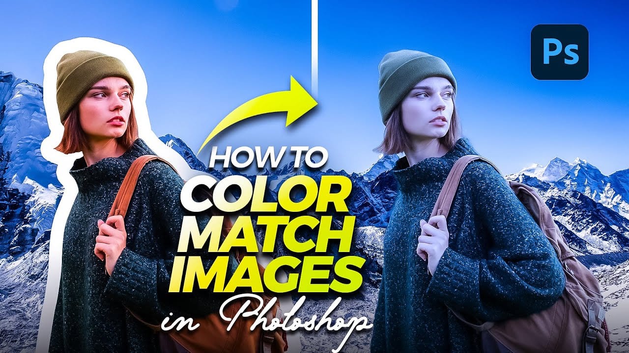
Color consistency between images can make or break a professional composition. When combining photos from different sources, lighting conditions and camera settings create jarring color mismatches that immediately reveal the edit.
Photoshop's Match Color tool provides a direct solution, automatically analyzing and transferring the color characteristics from one image to another with precision control.
Watch the Tutorial
Video by Kepo Art Studio. Any links or downloads mentioned by the creator are available only on YouTube
Essential Match Color Tips
- Minimize your reference image — Resize the reference layer smaller so you can clearly see the color changes as they happen
- Work from the background layer — Always select your main background layer before accessing the Match Color dialog
- Use the Fade slider for control — Higher values reduce the effect strength, while lower values intensify the color matching
- Adjust luminance separately — The luminance slider controls brightness independently from color matching, preventing overly dark or bright results
- Place reference images as embedded — Use File > Place Embedded rather than opening separately to keep everything in one document
More Tutorials About Color Matching
Explore additional techniques for achieving perfect color harmony in your composite images.
How to perfectly match colors in Photoshop when combining photos
In this insightful tutorial, Colin Smith from Photoshop Cafe teaches you how to seamlessly match colors when combining multiple images in Photoshop. This process is crucial for ensuring that different layers or photographs blend together naturally and look cohesive.
Colin demonstrates how to use the Match Color feature to align the tones and hues of different images. He also covers techniques for creating grounding shadows, which help to anchor the combined elements and enhance the overall inte
How to Match Color in Photoshop for Beginners
Compositing images often requires precise color matching. When combining elements from different sources, slight variations in tone can disrupt the visual harmony, making the final image appear unnatural. Achieving a cohesive look is crucial for professional results.
This tutorial offers a straightforward method to blend disparate image elements seamlessly. The video demonstrates how to use Photoshop's built-in tools, specifically the Curves adjustment layer and Camera Raw, to unify the color p
Quick and Easy Method for Color Matching Images in Photoshop
Achieving visual harmony in composite images is a cornerstone of professional photo editing. When combining elements from different sources, discrepancies in color and lighting can immediately break the illusion of a unified scene, making the final image appear unnatural or poorly constructed.
This tutorial demonstrates a straightforward yet powerful method within Photoshop to perfectly align the color profiles of disparate images. Viewers will learn how to leverage Photoshop's built-in tools t
Six easy ways to select colors in Photoshop
In this episode of "3, 2, 1… Photoshop!", longtime Adobe evangelist Julieanne Kost shares essential tips and tricks for selecting colors in Photoshop. Julieanne introduces six easy methods to choose colors effectively, whether you're working on a detailed project or just need a quick color pick.
You'll learn how to use the eyedropper tool for precise color selection, manipulate foreground and background colors, and utilize the heads-up-display (HUD) color picker for a more interactive experienc