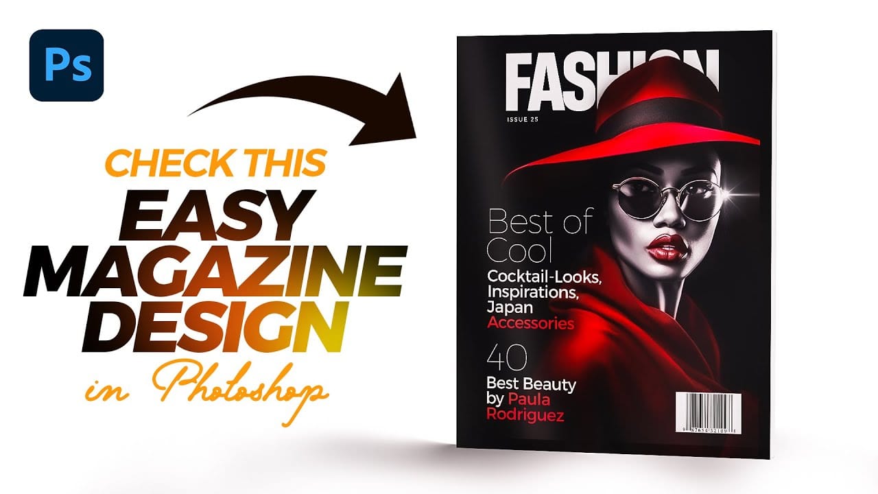
Designing a Magazine Cover in Photoshop

Designing a Magazine Cover in Photoshop

Magazine cover design combines typography, visual hierarchy, and image composition to create compelling editorial layouts that grab attention on crowded shelves. Modern magazine designs often feature bold typography that interacts dynamically with the cover subject, creating depth and visual interest through layering techniques.

This tutorial demonstrates the complete process of designing a professional magazine cover in Photoshop, from initial setup to final details. You'll learn essential techniques for text masking, color grading, shadow effects, and layout composition that are fundamental to editorial design.

Watch the Tutorial

Any links or downloads mentioned by the creator are available only on YouTube

Understanding Magazine Cover Design Principles

Successful magazine covers follow established design principles that balance visual impact with readability. The masthead typically occupies the top portion, while the main image serves as the focal point. Typography must work harmoniously with imagery, often requiring creative solutions like text masking to maintain both legibility and visual flow.

Visual hierarchy plays a crucial role in guiding reader attention. Cover lines, issue information, and barcodes must be positioned strategically without competing with the main title or overwhelming the design. The challenge lies in incorporating all necessary elements while maintaining clean, professional aesthetics.

Color relationships between text, background, and subject matter significantly impact the cover's effectiveness. Gradient overlays and blending modes can enhance contrast and create mood, while shadows and highlights add dimension to typography and improve readability across varying background tones.

Practical Tips for Magazine Cover Design

  • Set up your document with proper print dimensions (8.5" x 11" or A4) and include bleed areas for professional printing
  • Use layer masks instead of erasing to hide text behind subjects, preserving the original text for future edits
  • Apply gradient overlays with Color Dodge or Overlay blending modes to enhance contrast and create visual interest
  • Create subtle drop shadows behind text using soft brushes on separate layers with clipping masks for better control
  • Maintain consistent font families and establish clear typography hierarchy with varying weights and sizes

Explore more editorial design techniques and creative layout concepts.

Simplicity in Design: 6 Essential Concepts Worth Learning Early On
Great design isn’t about adding more. It’s about knowing what to leave out. With so much visual noise competing for our attention, simplicity has never been more powerful. Yet most creators, especially early in their journey, assume that more complexity equals more value. More filters. More layers. More
Web Typography: Essential Principles for Confident Design
Many designers frequently find themselves searching for “best font pairings,” hoping to stumble upon the ideal typography for their projects. This common struggle highlights a fundamental challenge: while typography appears straightforward, it is, in fact, one of the most significant factors in achieving great design. When executed correctly, good typography
Create a Colorful Flyer Design in Photoshop
This tutorial provides a straightforward guide to designing a flyer using Adobe Photoshop, perfect for both beginners and those with some experience. It starts with an introduction to the type tool, allowing you to add and manipulate text for your flyer. You’ll set the foreground color to white and choose
Crafting a Typographic Poster in Adobe Photoshop
Join Adobe’s UX Growth Designer, Curtis Ying, as he transforms a Swiss Typographic poster through an engaging design process. With the input from the Instagram community, this presentation showcases how he carefully selects a bold red background that sets the tone for the entire piece. Throughout the process, Curtis

Get tutorials & freebies delivered to you.

Subscribe to the Photoshop Roadmap newsletter, a weekly roundup of new tutorials, insights and quality downloads, trusted by 6500+ readers.

You might also like

Creating Pixelated Dither Effects in Photoshop

The pixelated dither effect transforms modern photographs into retro-inspired artwork reminiscent of early video games and vintage computer graphics. This distinctive visual style uses controlled color reduction and strategic pixelation to create images that balance nostalgic charm with contemporary design appeal. The technique relies on Photoshop's export settings...

How to Create a Vector Stencil from a Portrait Using Photoshop and Illustrator

Stencil art transforms complex portraits into bold, graphic statements using just black and white shapes. This simplified aesthetic has defined everything from street art to commercial design, creating instantly recognizable images that work across any medium. This tutorial demonstrates the complete workflow for converting a photograph into a clean vector...

How to Create Dotted Halftone Motion Blur Effects in Photoshop

The distinctive look of dotted halftone patterns combined with dynamic motion blur creates striking visual effects that bridge vintage print aesthetics with modern digital design. This technique transforms portrait photography into graphic art pieces with flowing, particle-like textures. The process involves layering multiple filter effects to achieve that coveted Instagram-worthy...

Master Photoshop Adjustment Layers for Non-Destructive Editing

Fine-tuning images without destroying original pixel data transforms ordinary photos into compelling visuals. Adjustment layers provide the flexibility to experiment with colors, contrast, and tones while maintaining complete control over every edit. This comprehensive guide demonstrates how to harness Photoshop's most powerful adjustment layers for landscape photography, from...

Understanding Color Theory for Digital Image Editing

Color theory forms the foundation of every successful digital editing project. From the visible spectrum to RGB channels, understanding how colors interact determines whether your adjustments look natural or artificial. This comprehensive breakdown covers essential color models, temperature and tint relationships, and the practical connections between traditional color theory and...

You’ve successfully subscribed to Photoshop Roadmap
Welcome back! You’ve successfully signed in.
Great! You’ve successfully signed up.
Success! Your email is updated.
Your link has expired
Success! Check your email for magic link to sign-in.