Creating authentic vintage t-shirt designs that capture the raw energy of 1980s screen printing presents a unique challenge. Modern digital tools often produce overly smooth, polished results that lack the gritty charm and technical constraints that defined the golden age of rock and roll merchandise.
This tutorial demonstrates how to recreate authentic 80s screen print aesthetics using Photoshop's hard mix blending mode, limited color palettes, and anti-aliasing restrictions. These techniques help designers understand the physical constraints of vintage screen printing while developing practical skills for retro merchandise design.
Watch the Tutorial
Any links or downloads mentioned by the creator are available only on YouTube
Understanding Screen Print Limitations in Design
The distinctive look of 1980s screen printed t-shirts emerged from technical constraints rather than artistic choice. Screen printing requires **separate screens for each color**, making complex color blends expensive and impractical. This limitation forced designers to work with restricted palettes, creating the bold, high-contrast aesthetics that define the era.
The hard mix blending mode in Photoshop naturally recreates these constraints by eliminating gradual color transitions. When combined with specific color values, this technique forces images into distinct tonal areas that mirror the separation process used in traditional screen printing. The result captures the authentic grittiness that made vintage band merchandise so visually striking.
Professional screen printers of the 1980s developed creative workarounds for technical limitations, including:
- Using halftone patterns to simulate gradients
- Layering transparent inks to create new colors
- Embracing registration errors as design elements
- Working with high-contrast imagery that reproduced well
Practical Tips for Vintage Screen Print Effects
- Limit your palette to six colors maximum — including black and white — to maintain authentic screen print constraints and visual impact.
- Use the pencil tool instead of brush tool when working with layer masks to avoid anti-aliasing and maintain crisp color separations.
- Apply shadows and highlights adjustments twice to flatten image contrast and create the high-contrast look typical of vintage screen prints.
- Convert image layers to smart objects before applying filters so you can adjust settings while maintaining the four-value tonal structure.
- Use blend-if sliders to target specific gray values when replacing tones with colors — this ensures precise color mapping without affecting other areas.
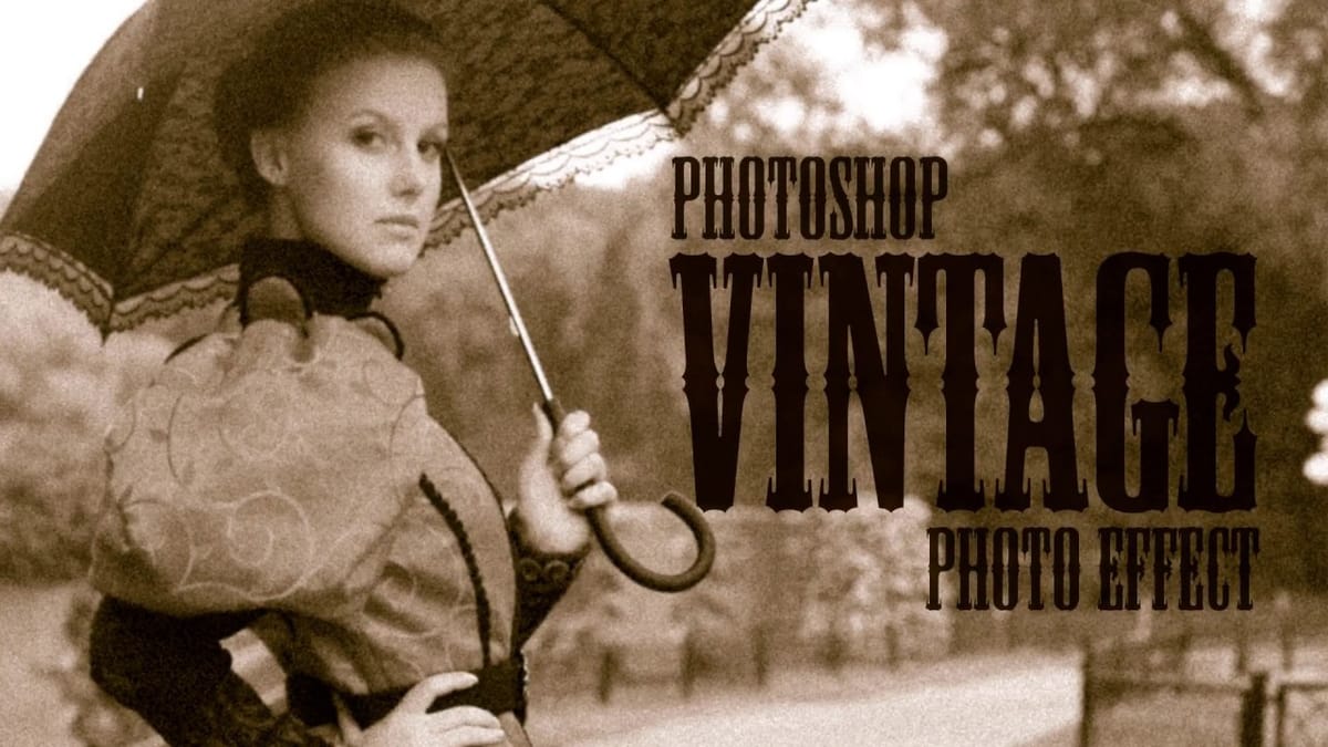
More Tutorials About Vintage Design Effects
Explore additional techniques for creating retro and vintage aesthetics in Photoshop.