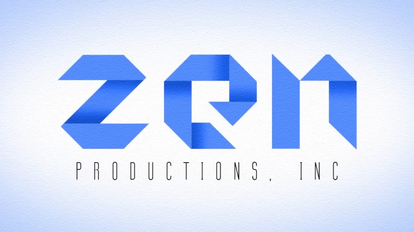
Create a beautiful origami text effect in Photoshop

Create a beautiful origami text effect in Photoshop

Origami art inspires unique design possibilities, and this tutorial explores how to bring that aesthetic into digital typography. Creating the illusion of folded paper can add a distinctive, handcrafted feel to your graphic projects.

Viewers will learn to transform standard text into a compelling origami-style logo using specific Photoshop tools and techniques. This process enhances design skills by focusing on precise shading and texture application, unlocking creative potential for unique branding and visual elements.

Watch the Video

Video by Blue Lightning. Any links or downloads mentioned by the creator are available only on YouTube

Achieving Realistic Paper Folds in Digital Typography

Digital design often seeks to replicate real-world textures and forms, and simulating origami folds in text involves a nuanced understanding of light and shadow to create depth and dimension. The illusion of folded paper relies heavily on precise shading, where each crease and overlap must be carefully defined.

This process transforms flat text into a three-dimensional object, similar to how traditional artists use chiaroscuro to define form. The strategic application of darker tones suggests the hidden areas and overlaps inherent in folded structures, giving the text a tangible quality.

The choice of font is also crucial; a typeface like "Origram," specifically designed with an angular, segmented structure, provides an ideal foundation. Its inherent geometry naturally lends itself to the folded aesthetic, making the subsequent shading work more effective and realistic.

Practical Tips for Creating Origami Text Effects

  • Select a suitable font, such as "Origram," which is designed to mimic folded paper, as a foundation for the effect.
  • Rasterize your text layer to enable direct manipulation and application of shading effects.
  • Use provided sample characters as a visual guide for accurately placing and shaping shadows.
  • Apply the Burn Tool with a "Midtones" range and 100% exposure to create realistic shadow depth.
  • Feather selections before inverting them to create soft, gradient backgrounds that complement the logo.

More Tutorials about Logo and Text Effects

Explore additional resources to enhance your design skills and create diverse visual effects.
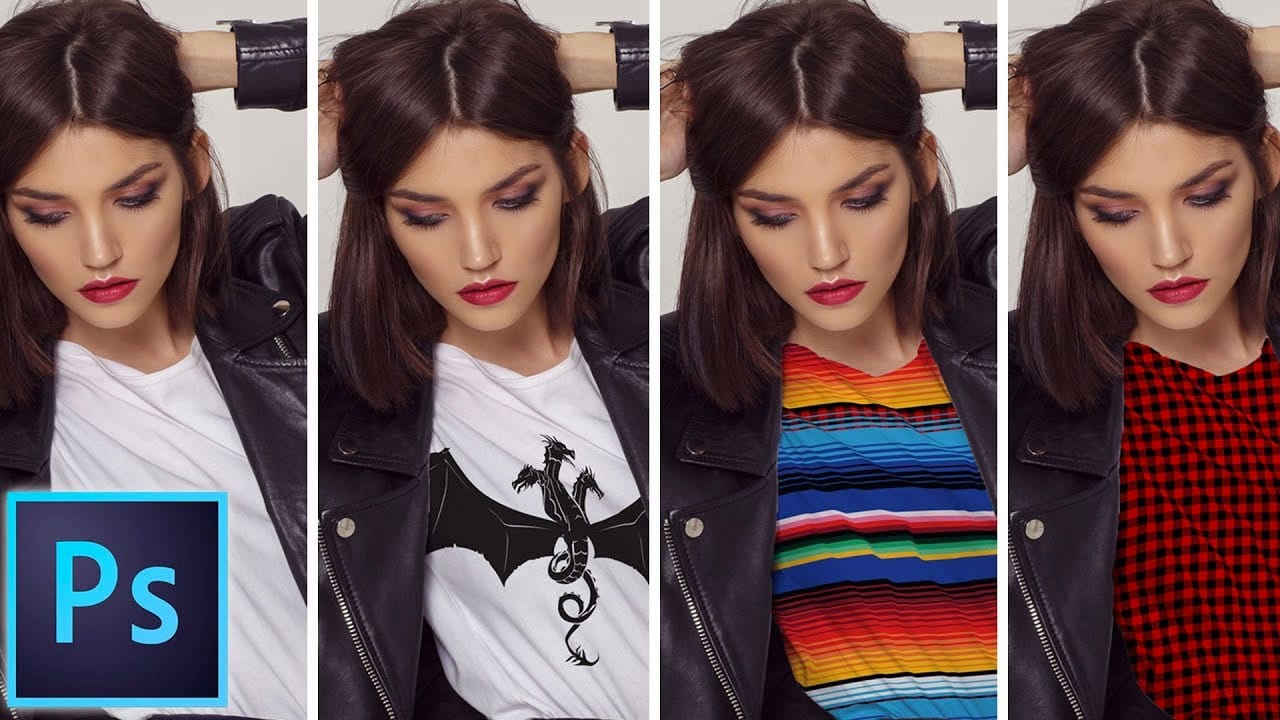
How to add a logo or pattern to a shirt in Photoshop
In his Photoshop tutorial, author Colin Smith guides viewers through the process of adding a logo, graphic, pattern, or texture onto clothing. This technique allows for quick and easy customization of apparel, enabling users to swap out designs in a matter of seconds. Smith's step-by-step instructions demonstrate how to seamlessly incorporate the desired visual element onto a shirt or other garment. By leveraging the power of Photoshop's layers and blending modes, users can achieve a profession
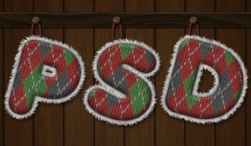
Create a Knitted Text Effect in Photoshop
This tutorial guides the reader through the process of using Filter Forge to create the knitted argyle effect, which can then be applied to text in Photoshop. This approach allows for a unique and visually appealing result that can be incorporated into various design projects. This technique can be useful for those looking to enhance their holiday illustrations. Photoshop plugins are powerful tools that can help save time and improve the quality of one's work. By utilizing the capabilities of
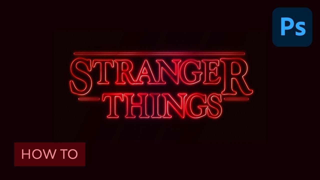
Learn how to create the Stranger Things tv show logo in Photoshop
Netflix’s Stranger Things is a hit. So is the 80’s culture revival. Horror movies from that time were scary and fun at the same time and that’s something this show was able to capture with success. But for those who aren’t designers, there was something that helped to set that ambiance: the awesome 80’s styled logo. If you think you saw it before, but don’t remember where, just go to your bookshelf and grab some of your old Stephen King books. And if you still have them, then check your Choose
How to Make a Bauhaus Inspired Graphic Design in Photoshop
This tutorial offers an engaging approach to creating a Bauhaus-inspired graphic design using Photoshop CS6. Perfect for both beginners and seasoned designers, it guides you through the process of designing a vibrant, modernist piece that features a name. You will learn to incorporate fundamental elements of the Bauhaus style, including bold color palettes and geometric shapes. The tutorial breaks down each step, ensuring you understand how to manipulate various tools and layers within Photosho

Get tutorials & freebies delivered to you.

Subscribe to the Photoshop Roadmap newsletter, a weekly roundup of new tutorials, insights and quality downloads, trusted by 6500+ readers.

You might also like

Creating Pixelated Dither Effects in Photoshop

The pixelated dither effect transforms modern photographs into retro-inspired artwork reminiscent of early video games and vintage computer graphics. This distinctive visual style uses controlled color reduction and strategic pixelation to create images that balance nostalgic charm with contemporary design appeal. The technique relies on Photoshop's export settings...

How to Create a Vector Stencil from a Portrait Using Photoshop and Illustrator

Stencil art transforms complex portraits into bold, graphic statements using just black and white shapes. This simplified aesthetic has defined everything from street art to commercial design, creating instantly recognizable images that work across any medium. This tutorial demonstrates the complete workflow for converting a photograph into a clean vector...

How to Create Dotted Halftone Motion Blur Effects in Photoshop

The distinctive look of dotted halftone patterns combined with dynamic motion blur creates striking visual effects that bridge vintage print aesthetics with modern digital design. This technique transforms portrait photography into graphic art pieces with flowing, particle-like textures. The process involves layering multiple filter effects to achieve that coveted Instagram-worthy...

Master Photoshop Adjustment Layers for Non-Destructive Editing

Fine-tuning images without destroying original pixel data transforms ordinary photos into compelling visuals. Adjustment layers provide the flexibility to experiment with colors, contrast, and tones while maintaining complete control over every edit. This comprehensive guide demonstrates how to harness Photoshop's most powerful adjustment layers for landscape photography, from...

Understanding Color Theory for Digital Image Editing

Color theory forms the foundation of every successful digital editing project. From the visible spectrum to RGB channels, understanding how colors interact determines whether your adjustments look natural or artificial. This comprehensive breakdown covers essential color models, temperature and tint relationships, and the practical connections between traditional color theory and...

You’ve successfully subscribed to Photoshop Roadmap
Welcome back! You’ve successfully signed in.
Great! You’ve successfully signed up.
Success! Your email is updated.
Your link has expired
Success! Check your email for magic link to sign-in.