Achieving a distinct vintage sci-fi aesthetic often involves intricate color manipulation beyond simple desaturation. This tutorial demonstrates a surprising approach to color grading, using specific color balance adjustments across shadows, midtones, and highlights to infuse a retro tone. For instance, cyan/red is pushed to +100 in all three tones, while yellow/blue is consistently set to -100.
This precise method, combined with the Diffuse Glow filter and careful Brightness/Contrast settings, transforms a standard skyline into a scene reminiscent of 1950s cinematic backdrops. The technique is a masterclass in shaping mood and era without relying on complex, multi-layered color lookups.
Watch the Video
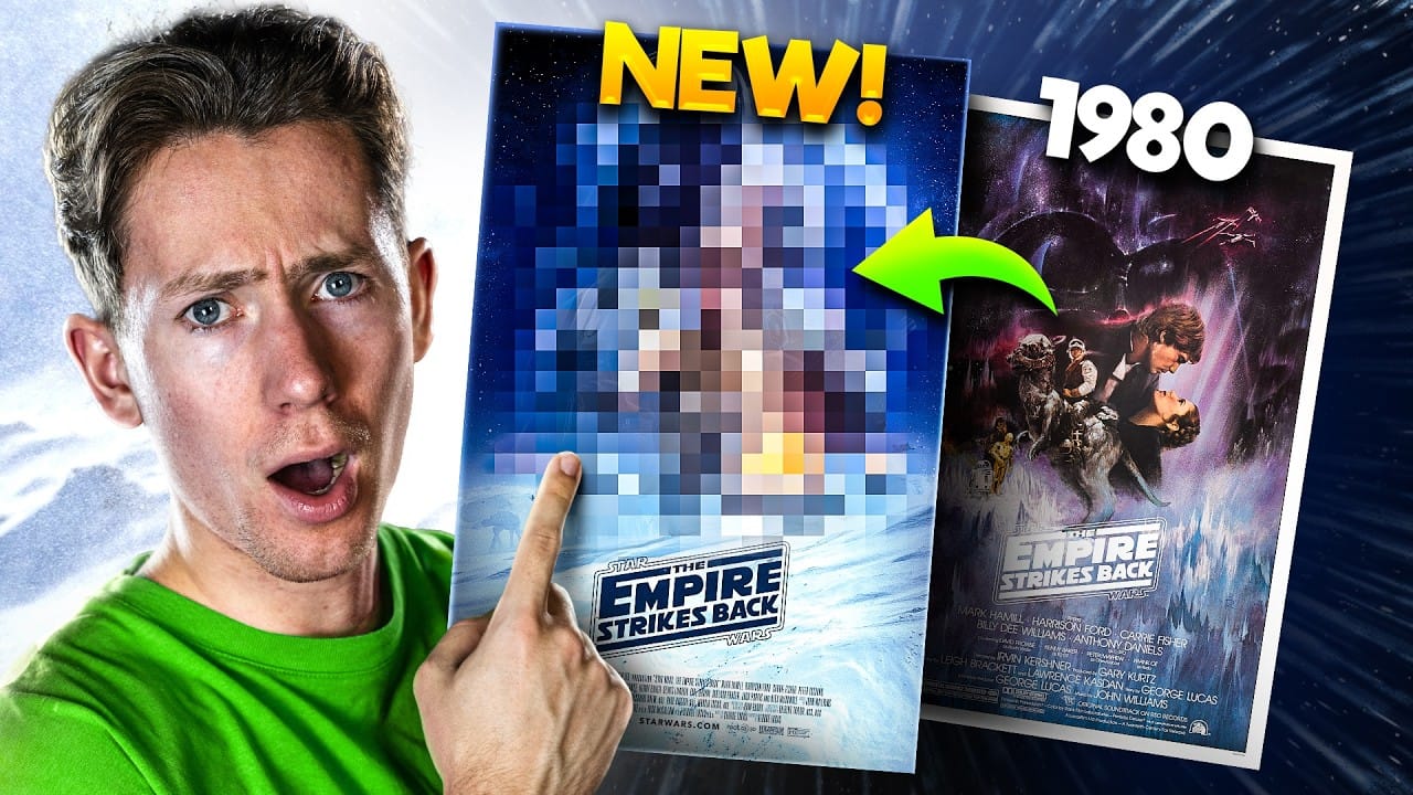
Emulating Vintage Sci-Fi Aesthetics in Photoshop
1950s science fiction movie posters captured the public's imagination with their distinct visual language, often characterized by dramatic illustrations, stark contrasts, and a limited, yet impactful, color palette. These posters aimed to convey a sense of wonder, impending doom, or technological marvel, frequently employing simplified forms and a focus on iconic elements like towering robots or futuristic cityscapes. The aesthetic frequently borrowed from pulp magazine covers, emphasizing bold typography and a tangible, almost tactile, quality.
Replicating this era's visual style in digital art involves more than just applying a sepia tone. It requires understanding how to manipulate color channels and luminosity to mimic the limitations and artistic conventions of the time. Filters like Diffuse Glow can simulate the soft, slightly out-of-focus quality of older film, while precise Color Balance adjustments can shift the entire tonal range to a specific historical tint.
Furthermore, integrating authentic textures, such as paper creases and stains, is crucial for grounding the digital creation in a tangible, vintage reality. These subtle details, often achieved through blend modes like Multiply, provide the visual cues that transport the viewer back to a bygone era of cinematic promotion.
Practical Tips for Retro Poster Design
- Global Layer Control: Quickly hide or show multiple layers by Alt/Option-clicking the eyeball icon of a single layer, making it efficient to isolate elements.
- Precise Color Toning: Use
Color Balanceadjustments across shadows, midtones, and highlights with specific numeric inputs to achieve consistent vintage color grades. - Atmospheric Vignettes: Create a darkening vignette effect by using the
Elliptical Marquee tool,Transform Selection(with locked aspect ratio), and a highFeatherradius to seamlessly blend the edges. - Text Styling for Impact: Employ
Vertical ScaleandWarped Text(Arc Upper) to create dynamically stretched and curved titles, enhancing the retro aesthetic. - Texture Integration: Apply paper textures with
Multiplyblend mode to instantly age and distress the entire poster, adding a crucial layer of authenticity.
Related Articles and Tutorials about Poster Design
Explore further techniques for creating vintage and movie poster designs in Photoshop with these related articles and tutorials.