Recreating classic cinema's visual aesthetics is challenging. This tutorial focuses on 1940s horror, known for its evocative, often Gothic and distressed typography, and atmospheric effects that create a chilling tone. Learn to design a period-accurate horror movie title in Photoshop, covering text manipulation, vintage effects, and seamless integration into a dramatic background, gaining practical skills for historical design projects.
Watch the Tutorial
Video by Blue Lightning. Any links or downloads mentioned by the creator are available only on YouTube
Practical Tips for Vintage Title Design
- Utilize provided templates and custom assets like brushes to streamline the design process and maintain consistency.
- Employ the Character/Paragraph panel for precise text manipulation, including adjusting leading (line spacing) and tracking (character spacing) for a refined look.
- Convert text layers to Smart Objects before applying transformations such as warping or blurring to preserve editability and non-destructive workflows.
- Create multi-layered drop shadows by duplicating and offsetting text layers, then grouping and transforming them to build a solid, dimensional effect.
- Apply subtle blur filters, like Blur More, to integrate text seamlessly with existing background elements, matching the overall softness or texture of the image.
More Tutorials about Movie Poster and Title Design
Explore additional resources to enhance your skills in creating compelling cinematic visuals and poster art.
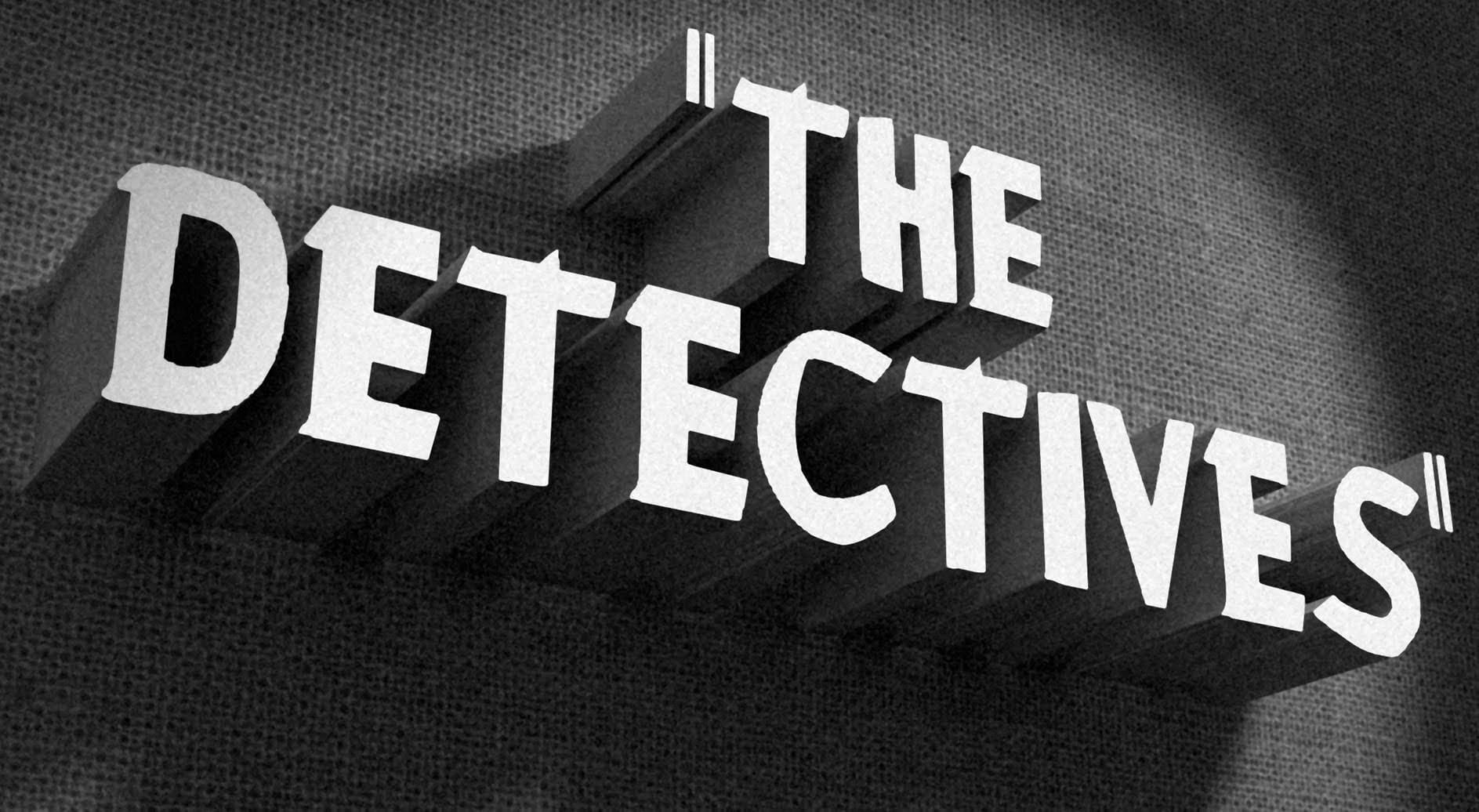
How to Create a Vintage, Film Noir Movie Title in Photoshop
In this Photoshop tutorial by BlueLightning TV, you'll learn how to design and create a film noir movie opening title card, reminiscent of crime dramas from the 1940s and 1950s.
The tutorial guides you through the process step-by-step, demonstrating techniques to achieve the classic film noir aesthetic using typography, textures, and atmospheric effects in Photoshop.
Whether you're a fan of vintage cinema or looking to create a nostalgic title card for a project, this tutorial provides the ski
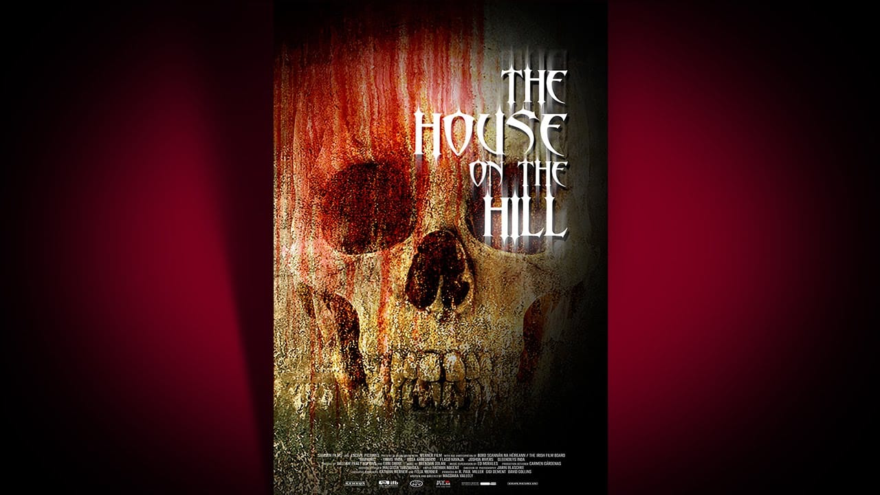
Create a Bone-Chilling, Horror Movie Poster in Photoshop
In this tutorial by Marty Geller from Blue Lightning TV, you'll learn how to design and create a bone-chilling horror movie poster in Photoshop.
Marty demonstrates how to combine elements such as dripping blood, a human skull, and ghostly, ethereal text to craft a powerful and haunting visual. The tutorial guides you through each step, showing you how to use various Photoshop techniques to achieve a dramatic and eerie effect.
This tutorial is ideal for those looking to create a striking horror
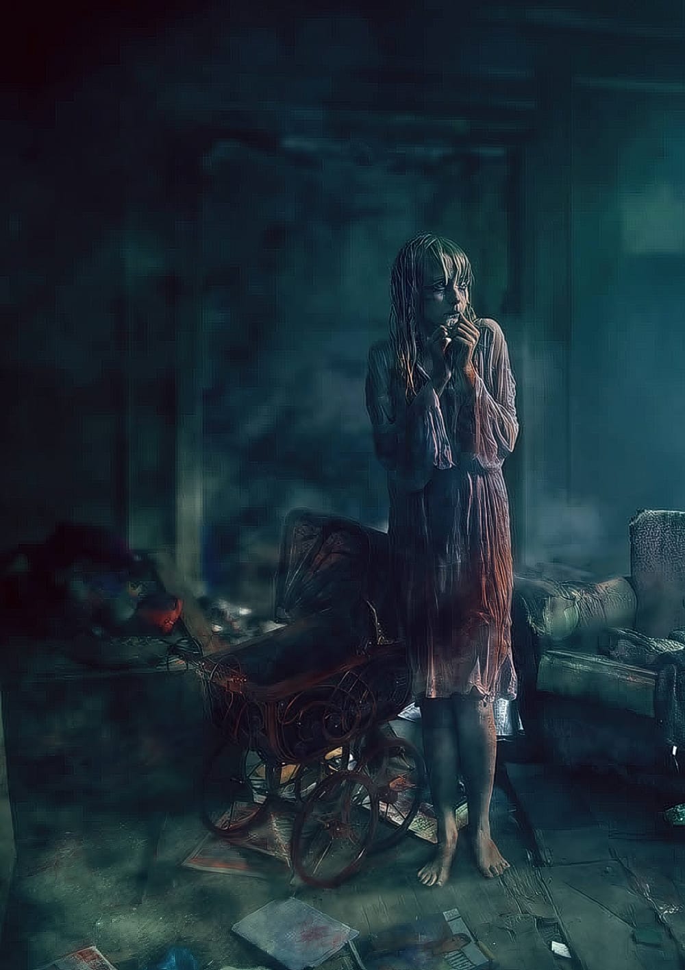
Create a Horror Scene Photo Composition in Photoshop
In this engaging tutorial, Mario Sanchez Nevado from Tuts+ guides you through the process of creating a horror movie-themed photo composition in Photoshop.
You'll learn how to choose the right photos and blend them together seamlessly to achieve a realistic and believable result. Key techniques covered include balancing light, using midtones, creating depth of field, and mastering blending methods. This tutorial is perfect for those looking to enhance their photo manipulation skills and create
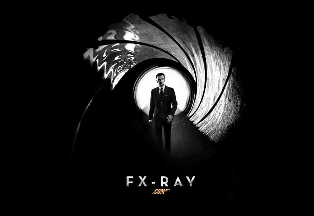
Create a Sky Fall Inspired Movie Poster in Photoshop
If you're looking to create an eye-catching movie poster in Photoshop, this guide offers a straightforward approach to designing a dark, black and white James Bond-inspired piece, reminiscent of Skyfall.
You will start with essential techniques, including layering, blending, and using filters to achieve that cinematic feel. Each step is well-explained, allowing you to understand the process clearly.
You'll learn how to manipulate images effectively, ensuring that every element of your poster a